CDC Food Safety
The CDC released information highlighting the before and after steps on how to grill safely. The inverted pyramid structure of the food safety information page could have effectively highlighted the most crucial information but failed to do so.
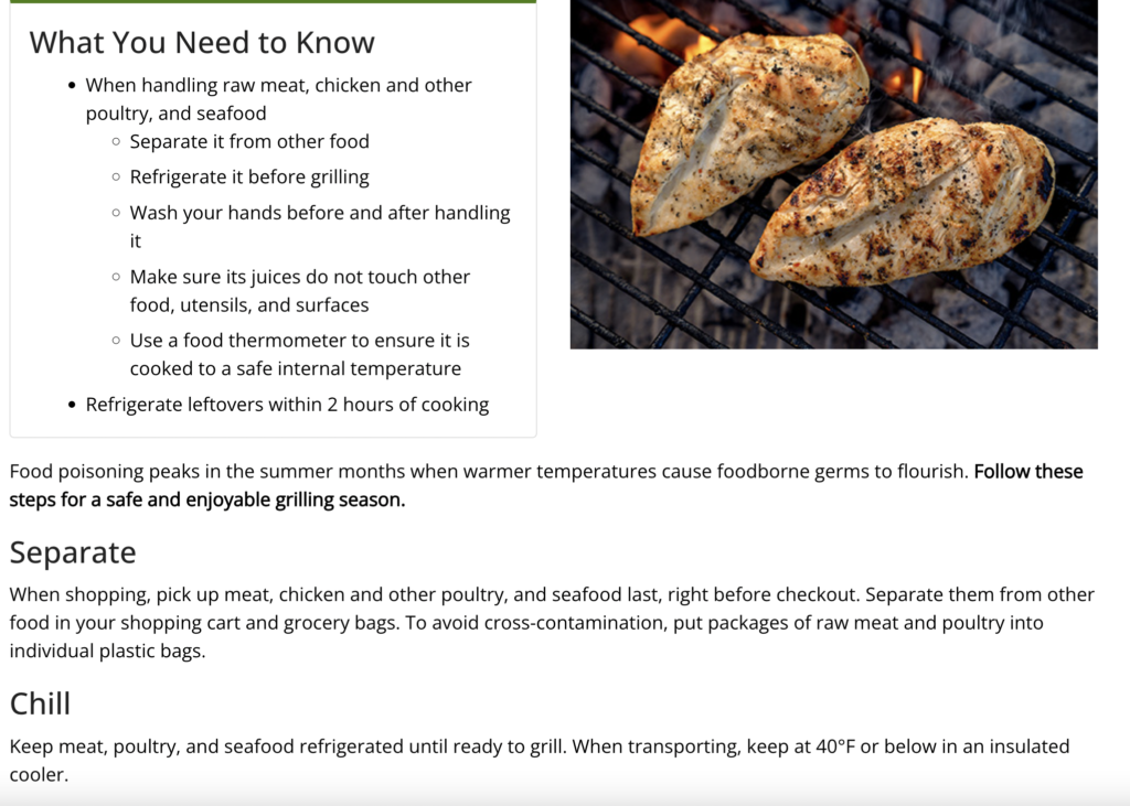
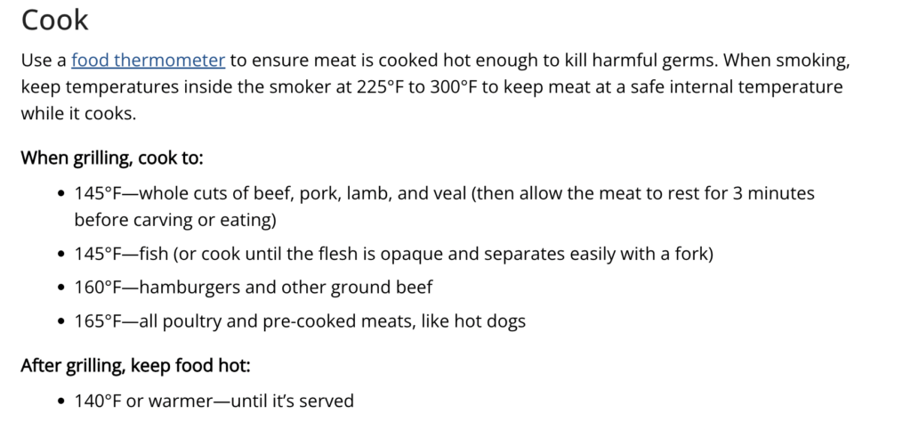
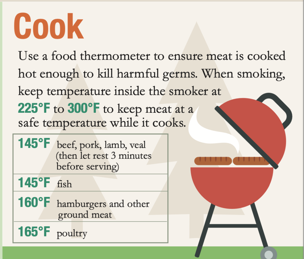
The lead is lacking in depth because it indicates food poisoning and food-borne illness but it never goes into further detail. While the body content is useful there are no direct quotes and the kicker ends abruptly while not ending on a call to action. The lead of the food safety information, talks about making sure food is cooked at a safe internal temperature. While this is the most crucial information it lies in the “Cook” section at the bottom. This design for the temperature information is hard to read on both the page and the infographic.
The CDC has done a sufficient job of capturing the main highlights of the information in the infographic format. This is because they cross-reference the same steps in both the flier and the infographic.
Design Principles
The food safety infographic provides information about the proper handling, storage, and cooking of food.
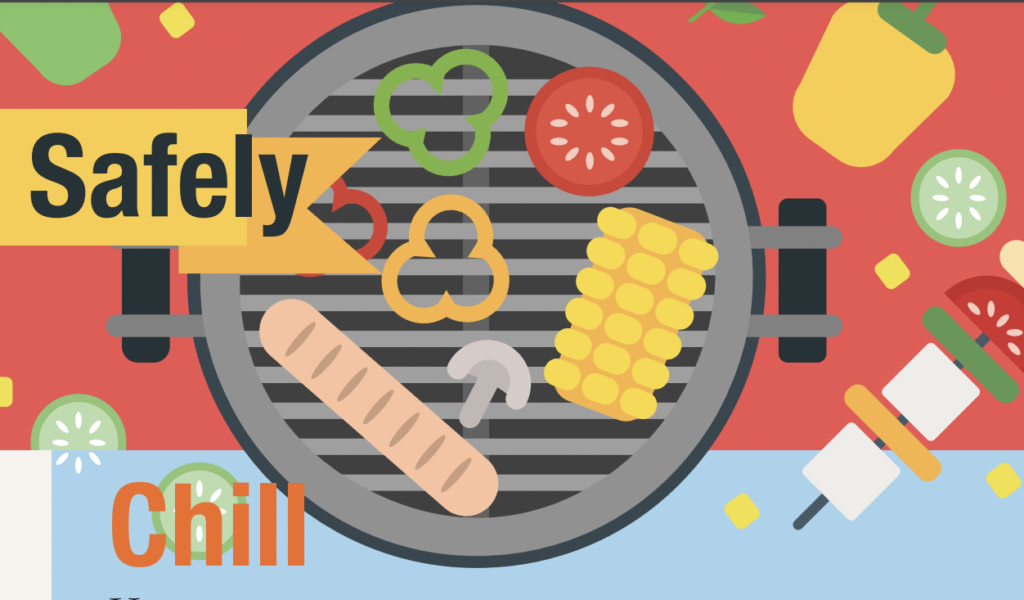
The headers are a repeat of the keywords in the safety information page. The words include “Separate”, “Clean”, “Cook”, ”Chill”, and “Refrigerate” which help reinforce the key overall message. The text is well-aligned but the layout is spaced out oddly. The headliners “Chill” and “Cook” are a little off in alignment compared to the other headliners. Also, in the “Cook” section the temperatures are ill-aligned.
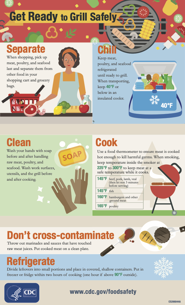
The colors are not effective because there’s no common theme. When the infographics highlight the numbers in the green color and a different font it does not stand out and blends into the background. The orange coloring does not pair well with the different colored backgrounds in each of the boxes.
The infographic shows seven key pieces of information that are unbalanced. For example, the photos in the “chill” and “Don’t cross-contamination” overlap with the other boxes and make it look messy. The text boxes are even but have unnecessary gaps such as cream-colored lines between them.
The graphic would have been more efficient if there were six boxes to make the infographics not uniform. The use of whitespace is poorly used because the photos or fronts are too big with spaced-looking gaps.
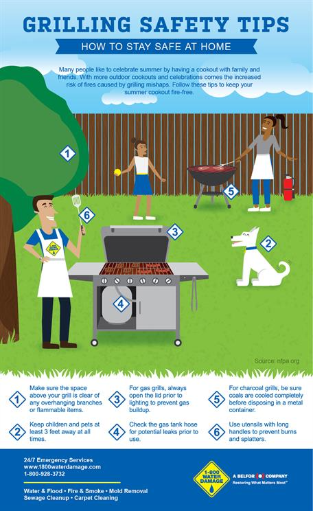
The grilling safety tips infographic by Silverleafmanagement is well-designed, with a clear layout. It has a great whitespace that enhances readability and has a smooth flow in design. The choice of font and colors make the content easy to read in comparison to the CDC’s infographic.
https://silverleafmanagement.com/grilling-safety-tips/
The photos are also very misleading because the infographics are supposed to be about cooking seafood, meat, and other poultry food. The pictures show more vegetables in the photo, which is not in line with what the infographics talk about.
Overall, the CDC has done an alright job capturing the main highlights between the information within the website page and the infographic.
One reply on “Grilling Safety”
great work, jillian! your comparison to the other poster is a great way to talk about principles that are strong/need some work. good suggestions for improvement here.